Designing the HMX design system
Harvard Medical School — HMX online learning: course platform, interactives, Partner Dashboard, and marketing site
Where it started
HMX is Harvard Medical School’s online learning, delivered through edX. I was hired in part to improve the UX of the course platform, right as traffic was increasing because of the pandemic.
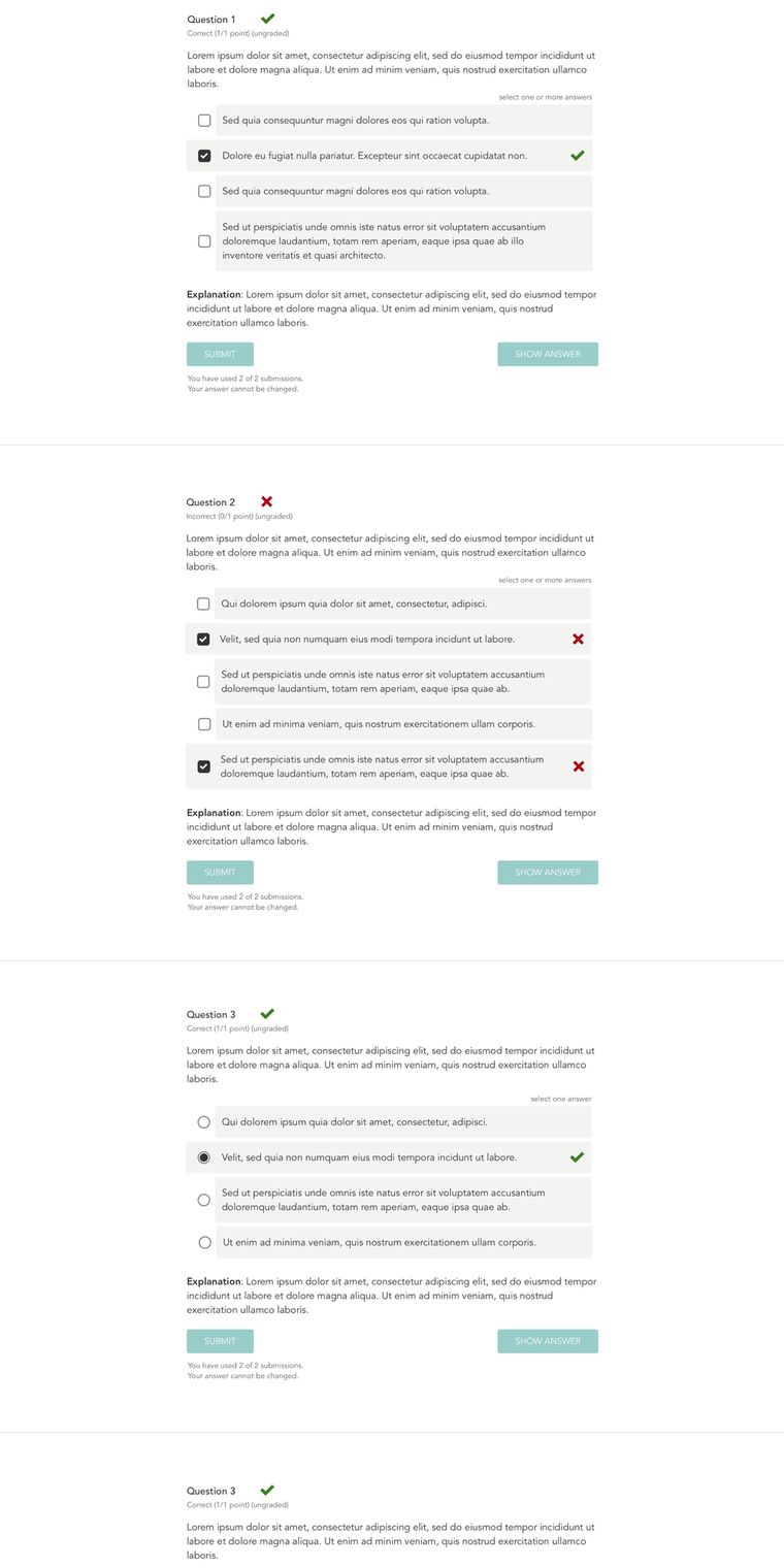
Most of that work was new designs for components that already existed, with a particular focus on accessibility. The edX components came with the platform, so we couldn’t replace them, only improve them, and some of them, drag and drop included, weren’t accessible at all.
Courses also ran on interactives, which were the gamified sections of course content and the more UI-heavy pieces like a step-by-step player and a hotspot viewer. Those were one-off builds, and each one drew on the same components as the rest of the platform.
Two other surfaces came with the job. One was a marketing site on WordPress, where I standardized the components. The other was a Partner Dashboard the developers had built, a tool course owners, corporate managers and professors could log into to track how their groups were doing in courses, where I made UX and UI improvements. None of these shared anything with each other, so I proposed the design system.
What I built
| Namespace | Symbols | Purpose |
|---|---|---|
| LMS | 207 | Course player, assessments, navigation, outline |
| Global | 167 | Shared foundation — footers, accordions, pagination, inputs |
| Partner dashboard | 80 | Admin cards, reports, callouts |
| WordPress | 76 | Marketing pages, staff cards, site navigation |
Accessibility in the system
Part of the focus was getting accessibility decided while we were designing, rather than catching it later in review.
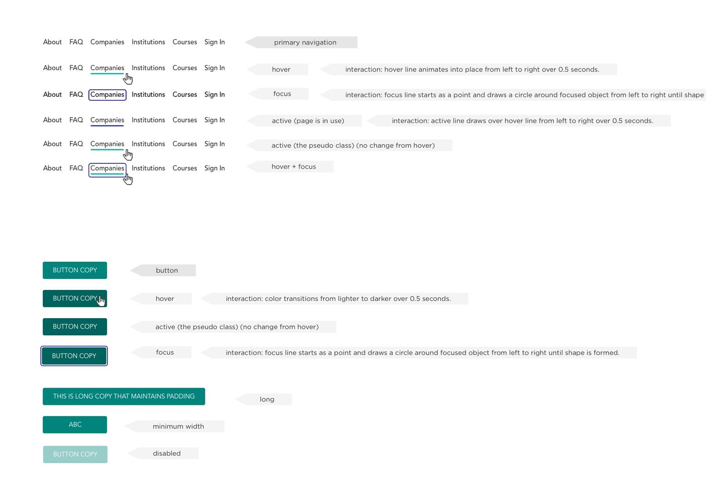
Focus, hover, disabled and active states were all built as components, which mattered because a developer normally picks a focus ring during implementation and it ends up different depending on who wrote it. Designing the states meant keyboard users got the same thing mouse users got, everywhere, by default.
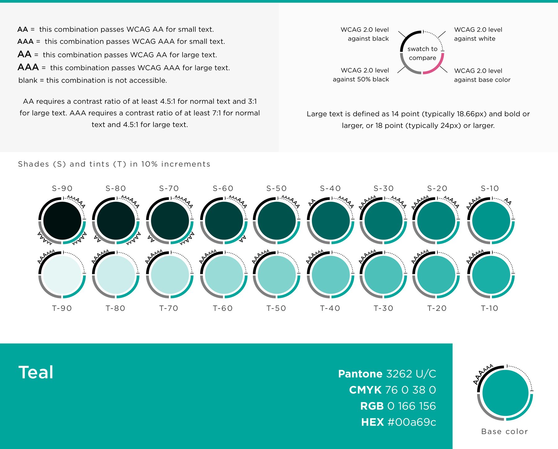
Each brand color got nine shades and nine tints in 10% steps, used by some components and by some content. The point was to get those increments made as variables, instead of designers and developers each picking whatever looked good.
The system in use
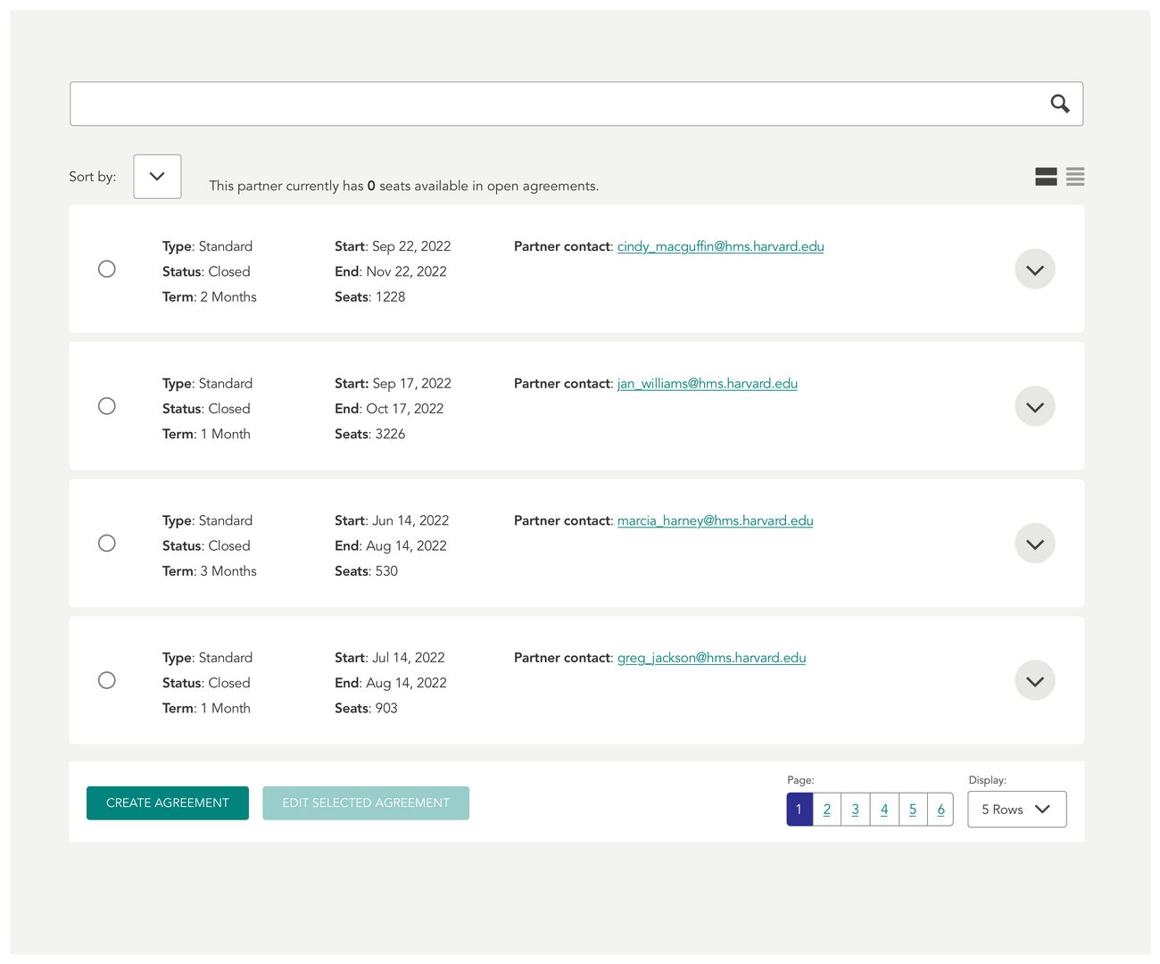
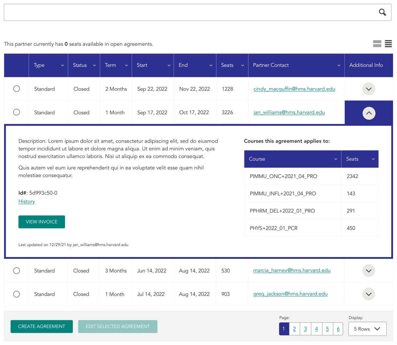
Two of the four surfaces, built from the same library.
Rebuilding drag and drop
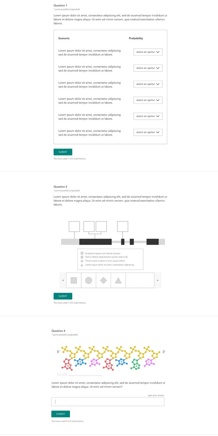
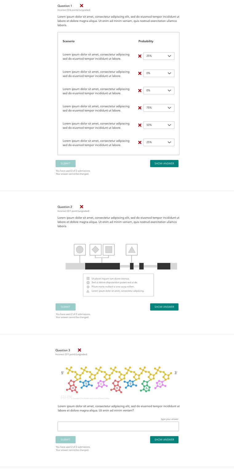
edX shipped a drag-and-drop component that courses used heavily, for sorting items, labelling diagrams and matching text to parts of an image, but it couldn’t be done on a keyboard or with a screen reader, and on a phone the drag fought with scrolling. I rebuilt it to be accessible and prototyped it in working HTML, CSS and JavaScript for the development team to build, and that version is what courses used afterward.
The genetics pedigree is that same component, just heavily skinned for the genealogy content. Each
family member is a <select> and the connector lines are CSS, so it reflows on a small screen
instead of needing pinch and zoom. Because every node is an input rather than a picture, it can also
be graded — pick a status for each person, submit, and each one comes back right or wrong.
Outcome
Courses adopted the components, and the system became what the team checked against whenever the LMS moved to a new version of edX, so upgrades didn’t undo design and accessibility decisions on the way through.
The Partner Dashboard was eventually dropped, and the HMX team was later reorganized into a product development group, which is where my title came from.